


Hello everyone, Google recently released MaterialDatePicker: a useful new component that complies with the material design guidelines(material.io/components/pickers/#usage). This new component has a very interesting feature that allows you to select a date range instead of the old flow of selecting two dates: one "from" and one "to, i.e the component can be used as a DatePicker and a DateRangePicker. I was very excited about this and i wanted to use this in an update to a project i work on: to improve the user experience, sadly i could not find any examples or tutorials on using this lovely new component. So, I decided to make one, in this article I will be outlining the steps I took to make use of the MaterialDatePicker. This would be a really short article since, the MaterialDatePicker is really very easy to use.
- Firstly, we have to add the Material Design component library. So in the list of dependencies in your app-level build.gradle file. Add
implementation'com.google.android.material:material:1.2.0-alpha03'
at the time of this publication the latest release is '1.2.0-alpha03'. You can find the latest-release version number at https://github.com/material-components/material-components-android/releases
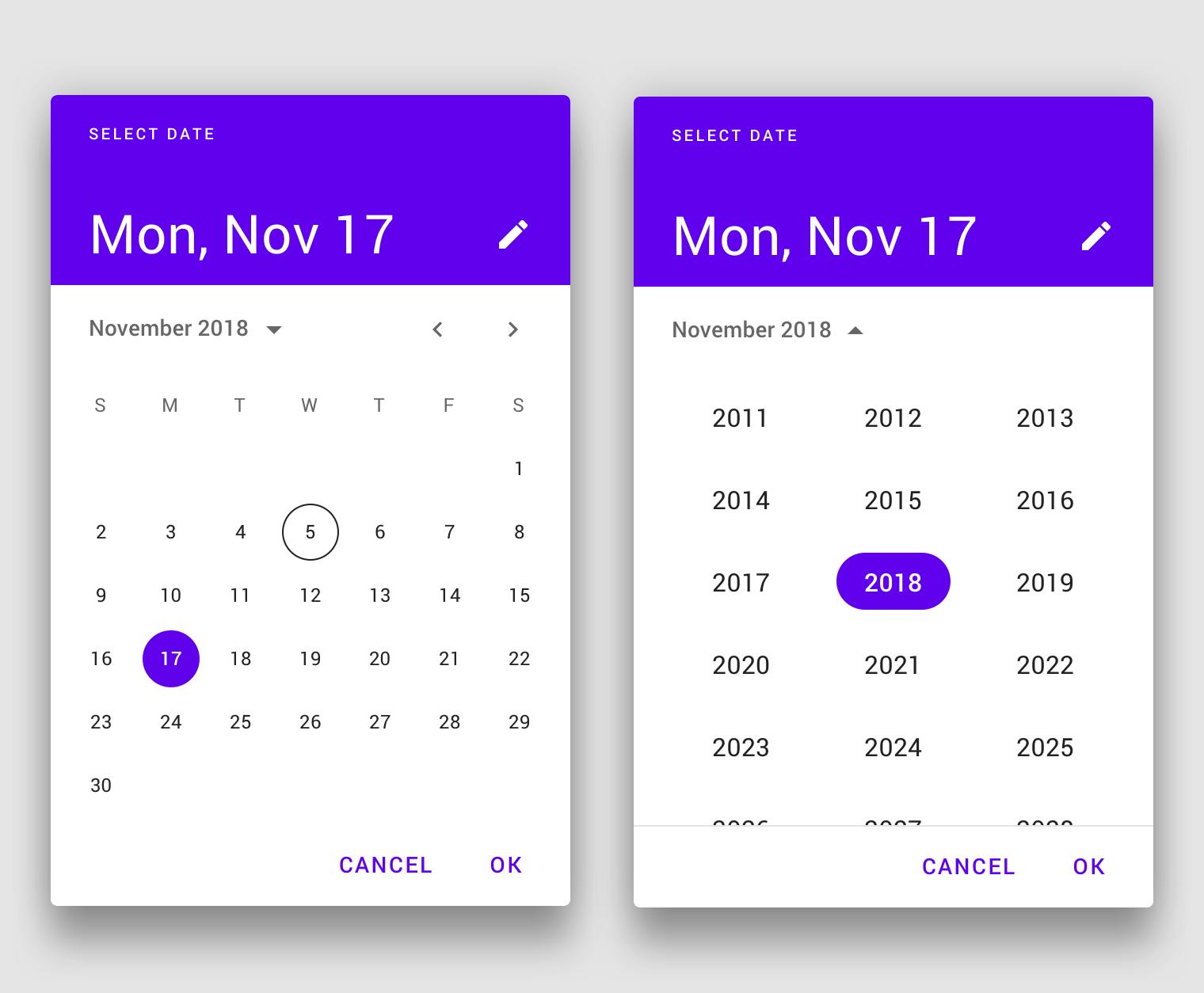
- Now, we have to initialize a builder, there are two ways of doing this, depending on the type of MaterialDatePicker you want. If you want one in which you can select only one date. You can do that like so:
//Date Picker
val builder = MaterialDatePicker.Builder.datePicker()
This would look like this:
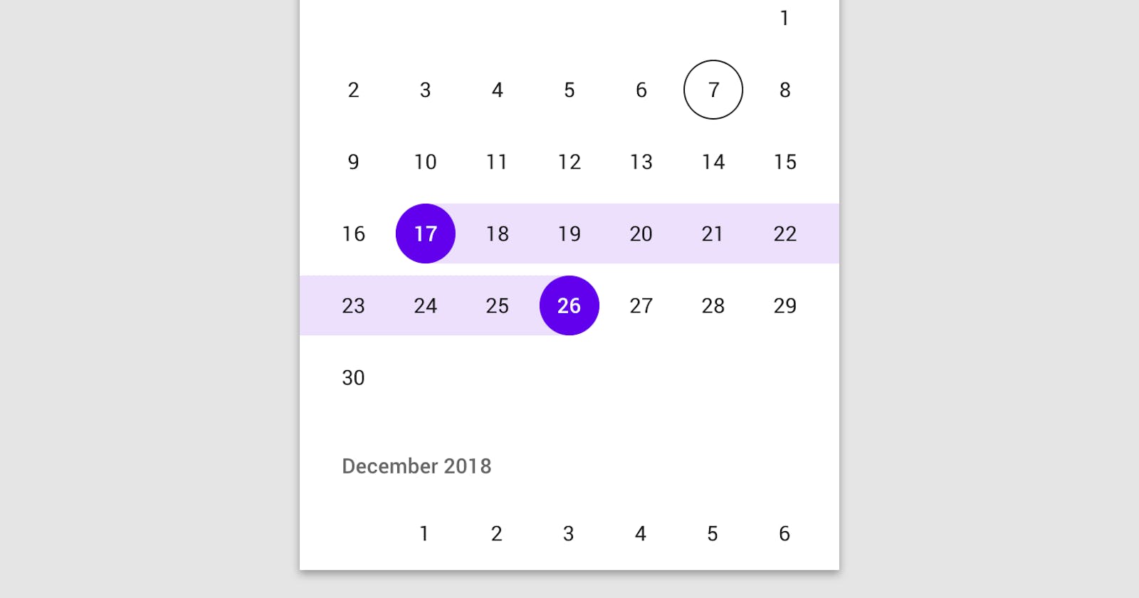
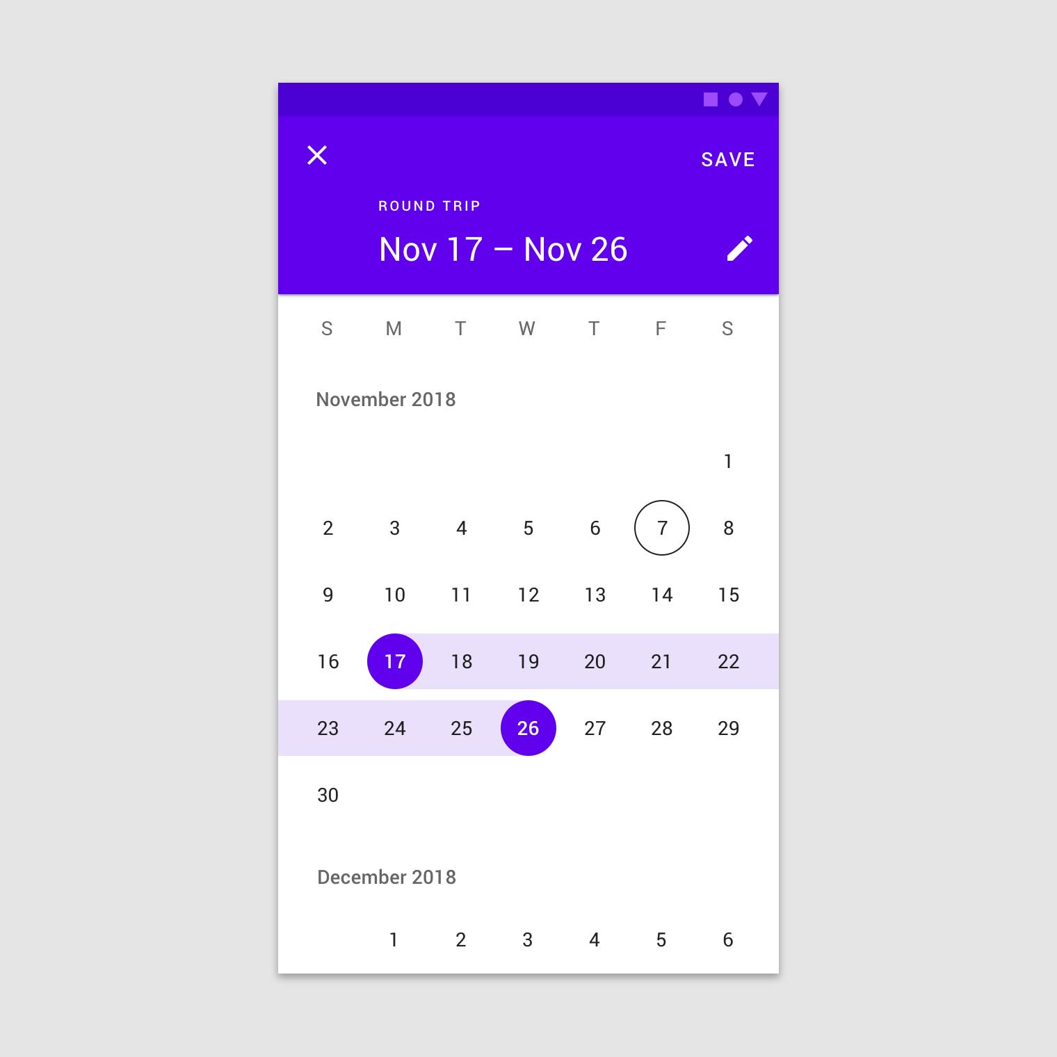
If you need a MaterialDatePicker you can use to select a range of dates you can do that like so:
//Date Range Picker
val builder = MaterialDatePicker.Builder.dateRangePicker()
- Now, it's time to create the picker, irrespectively of the builder you choose, you can always create a builder by calling:
val picker = builder.build()
to show the picker, we call:
picker.show(supportFragmentManager, picker.toString())
and thats all!!. However, we would always need to know what happens in our picker dialog. Let's do this in the next step.
- We would need to add three listeners for different scenarios, first lets handle the scenario when the dialog is cancelled:
picker.addOnCancelListener {
   Log.d("DatePicker Activity", "Dialog was cancelled")
  }
Now, we handle the scenario, where the dialog's negative button is clicked:
 picker.addOnNegativeButtonClickListener {
 Log.d("DatePicker Activity", "Dialog Negative Button was clicked")
 }
Finally, we have to cater for a successful operation. Depending on the type of MaterialDatePicker you have built, we can handle this in one of two ways. For a DatePicker, the selected value would be passed a unix epoch time value in a Long variable that is accessible as an argument in the PositiveButtonClickedListener lambda, it can also be read as a string in the header text of the Picker( Jan 10, Jul 28 etc). This is shown below
picker.addOnPositiveButtonClickListener {
Log.d("DatePicker Activity", "Date String = ${picker.headerText}:: Date epoch value = ${it}")
}
When using a date range picker the epoch values would be passed as a Pair object containing two Longs (Pair<Long, Long>). This can be handled as shown below:
 picker.addOnPositiveButtonClickListener {
 Log.d("DatePicker Activity", "Date String = ${picker.headerText}::  Date epoch values::${it.first}:: to :: ${it.second}")
}
That's all folks, thanks for reading this till the end, i hope i have been able to shed more light on this cool new feature. Please provide feedback if you think this article can be improved. Thank you!